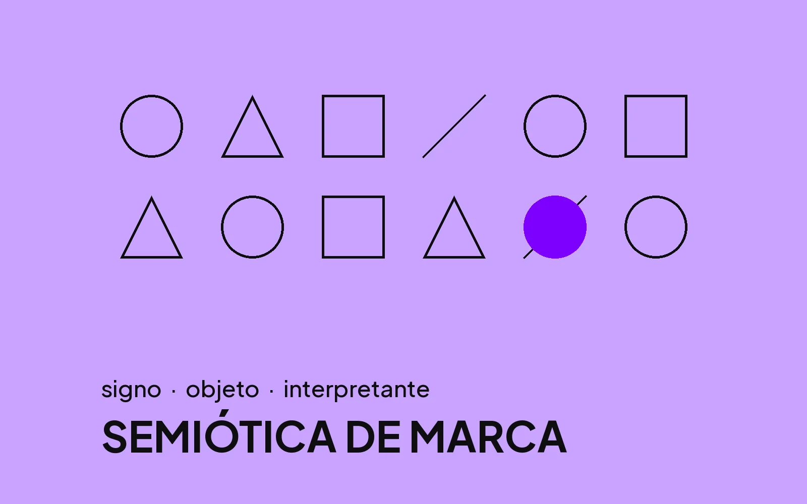
Every brand is a set of signs. Color, shape, typography, texture, silence and rhythm communicate long before the first word. Semiotics studies how these signals produce meaning, and it is one of the most powerful tools for building perceived value.
Sign, object and interpretant
Charles Peirce described the process of signification in three parts: the sign we see, the object it refers to and the idea that forms in the observer's mind. A well-built brand controls this chain with precision, so that the final idea is exactly the one intended.
The codes of luxury
- Generous empty space, which signals confidence.
- A restrained palette, with few colors and a lot of intent.
- Typography with refined drawing and careful spacing.
- Materials with texture, weight and finish you can feel.
- Photography with crafted light and calm composition.
The customer feels value with the eye and the hand. Reason arrives later to confirm it.Play8
When signs contradict each other
A premium clinic with a quick-print flyer, a solid industrial company with an amateur website, an excellent product in generic packaging. Every contradiction costs you in negotiation, because the customer distrusts what they see. A brand without coherence opens the conversation with a discount.
In practice
In every Play8 project, we map the signs the audience associates with the desired value and build the visual system from them. The result is a brand that looks like what it is, at every touchpoint.