
Proeletric
The market's technical truth, translated into a brand.
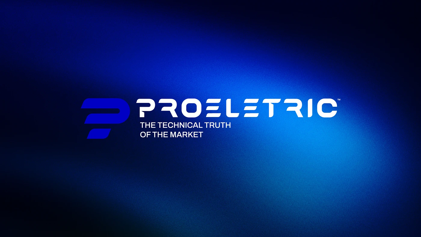
Technical precision is an invisible value until it takes shape. Proeletric's new brand gives that precision a body, a color and a voice.

Challenge
Communicate technical rigor in a market used to talking only about price.
Proeletric has deep technical knowledge and clients who depend on reliable solutions.
What was missing was a brand able to convey that authority before the first sales conversation.
Goal
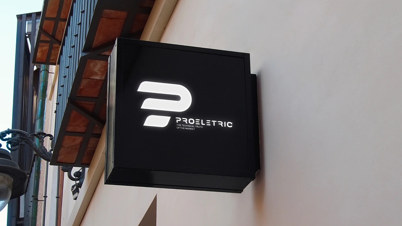
Design a firm symbol and a visual system that conveyed engineering and trust.
The P symbol combines the geometry of a connector with the movement of energy.
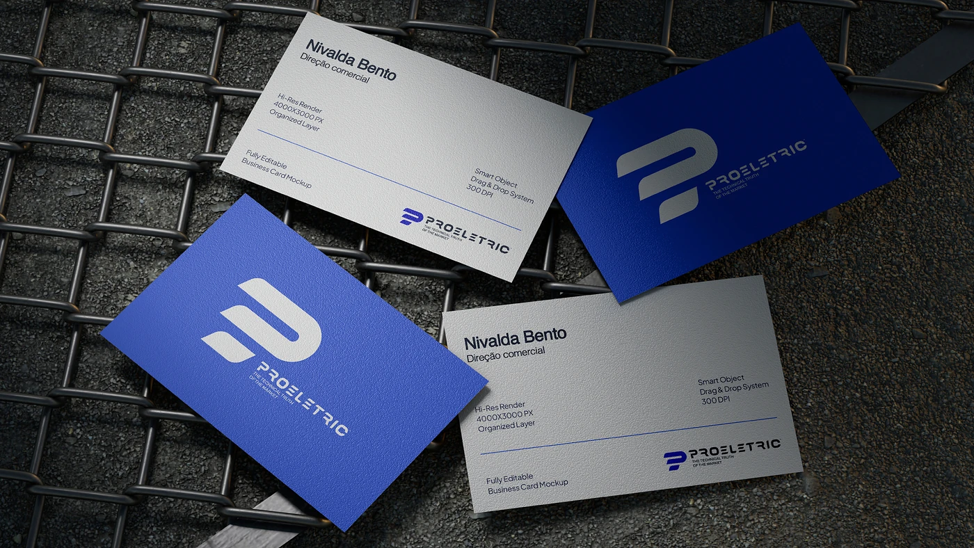
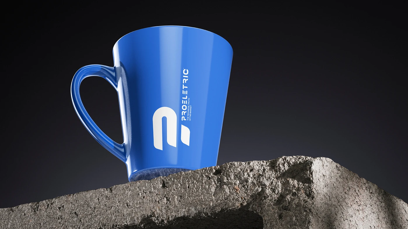
Around it we built the typography, an electric blue palette, signage, stationery and corporate applications.
Result
A solid brand foundation to support the tagline “The market's technical truth”.
The identity organizes all of the company's communication and paves the way for the next fronts of the project, such as the website and digital catalog.
Every application reinforces the same idea: here, technique comes before promise.
The market's technical truth.